Campus Update: What Inspired Our Architecture
In this conversation with our architects, we uncover the design influences and inspiration of the CoverMyMeds campus in Columbus, Ohio.

This month, we welcomed a small number of employees to the CoverMyMeds campus in Columbus, Ohio for a “return to office” pilot. It’s the first time we’ve been able to work together in-person since the start of the pandemic. For many, myself included, the experience was full of excitement to reunite with teammates. I was also delighted exploring our destination workplace.
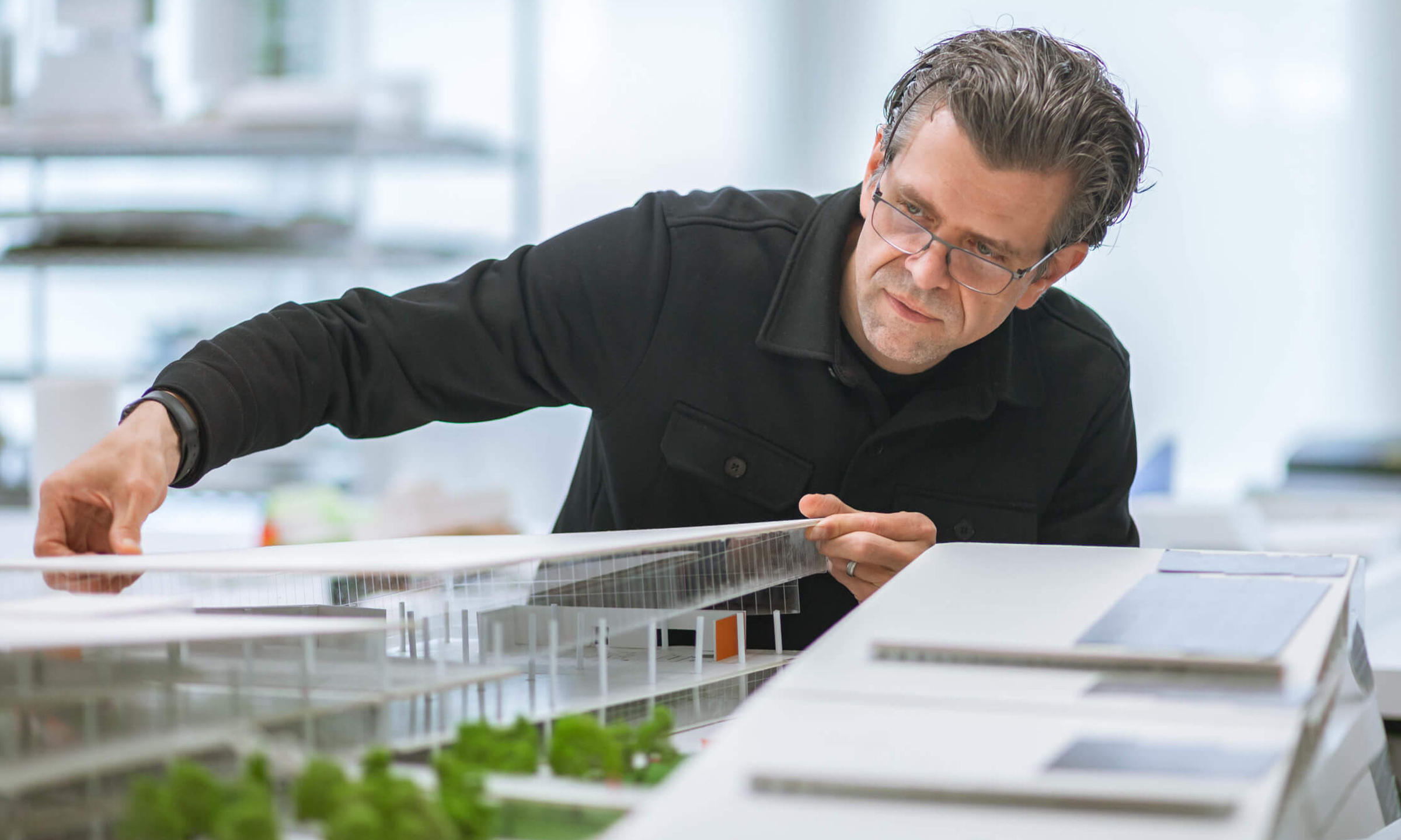
Checking out the space for the first time also led me to wonder how the remarkable building came to be. We caught up with the architects who created it — Ron Stelmarski and Matthew Crummey from Perkins&Will — to learn more about the design.
Taking cues from our culture
Ron: We knew about CoverMyMeds’ remarkable goals, and we heard a lot about the culture. The culture is about energy and vitality — there’s a pulse running through it. There’s a very clear vibe at CoverMyMeds with how they treat their staff. We wanted to turn up the volume and let the architecture convey the brand.
The first thing that struck me was how engaged employees are with the environment. When we first saw the site in Franklinton, it was invigorating. I saw the water moving, the way the clouds were passing and the environmental atmosphere. We wanted the building to have the same sense of movement.
Matthew: The culture of CoverMyMeds certainly drove the design. One of the things that was clear from the beginning was wanting this to be a great place to work. It’s important that people love coming to work here. The idea of having connection between indoors and outdoors was very much about making this a place that’s inviting and bright and that you look forward to coming to.

Creating a sense of connection
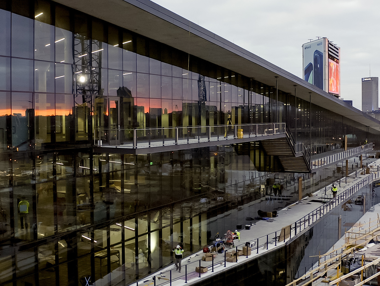
Ron: Throughout the design process, connectedness was a major theme. When you think about a space that's a destination workplace, it's about giving choice, it's about simultaneous activities — but it's also about connecting people to people. That's one reason why the architecture is so transparent.
Another key piece was the desire for there to be a sense of community. To achieve connectivity across a very large amount of square footage, we knew we had to create a seamless environment with sight lines and active pathways between floors. The lobby is a great example. You can stand on level one, two or three and look across and down with unimpeded views to the other spaces, the garden and the downtown skyline.
Matthew: As you stand on the first floor of the lobby and see someone on the third floor — maybe you think about catching up with that person. An open space really supports those visual connections. They help with collaboration and provide a feeling of connectedness to your working environment.
Ron: We want there to be a sense of community inside the building. But we also want you to be able to retreat to other areas where you feel like you're at one with yourself — you can have some personal focus time. It was always that balance of collective and individual that kept stretching with the destination workplace concept. There’s so much choice built in. The building is very elastic.
Inspired by the community
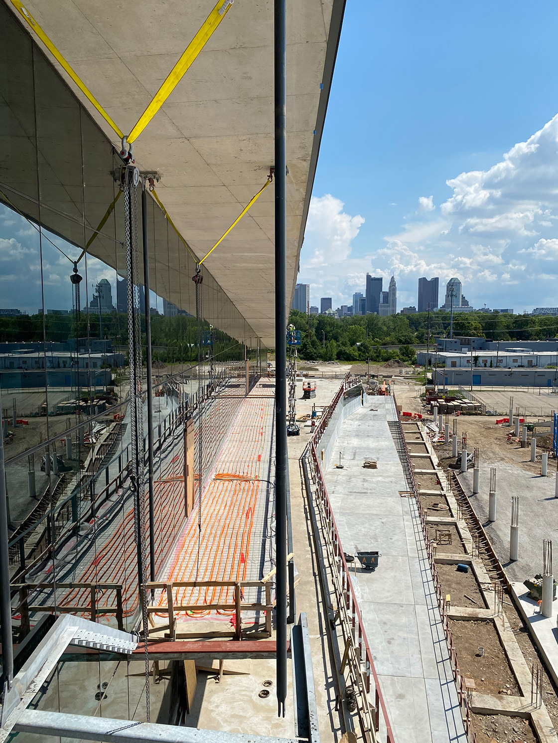
Ron: We brought inspiration from the way the site is woven into the city. You've got a river, you've got train lines, you've got the street scape and you've got all these great bridges that go over the water. The tangled infrastructure was a strong influence because we knew we had to weave CoverMyMeds into the community.
The campus really lurches toward downtown. It's reaching out, embracing and creating a bit of a handshake with the city. You can easily locate yourself visually. It's about rootedness. CoverMyMeds is rooted in Columbus, Ohio. Franklinton is very much the beginning of Columbus. We see this as coming back to where it all started. To be able to reflect on the city is amazing.

Importance of the outdoors
Matthew: The buildings sit next to each other, and they look inward on a planted area — a garden. That was a very conscious decision from the beginning. There’s a connection between indoors and outdoors. Using glass on the exterior dissolves any barrier. We did that so you could look into the heart of the campus and always have a visual connection between the two buildings.
Ron: A garden space in the middle is such an important piece. You can walk from the ground all the way up the outside of each building via cascading staircases within the garden. It’s another fantastic piece for people to explore. Inside, you can stand in one building, look out through the vegetation and see over to the other. That way of connecting is paramount.
I’m originally from Ohio and something I love are the seasonal shifts. When you're looking out to the garden, you're going to see the leaves change. You're going to see the snow and the rain fall. Those should all be attributes that create an evolving and wonderful experience. The play of light and shadow will be a treat throughout the day, breathing energy and a sense of refuge into the workplace.
What’s most interesting
Ron: In many ways, the garden space was the most interesting and challenging. It can easily be overlooked. No one necessarily thinks of the garden as being an important piece. But I think about the way we very deliberately pulled the landscape up and over on top of the parking deck. By pulling a carpet of landscape up and over the structure, it gave us some topography.
Matthew: Another interesting aspect of the design is the placement of the structures. The two buildings open up. They aren't parallel to one another. That pulling away opens up the campus toward downtown and offers great views of the skyline. The two-structure approach sparked a really interesting question: Are they really two buildings or are they one building split in half? In some ways, that's how we conceived it.
Our campus serves as a destination for our community and all our employees. Throughout the summer, we plan to safely welcome additional staff to campus little-by-little. We’ll also continue to offer our employees flexibility in where and how they work. Stay tuned for updates when we can safely welcome our neighbors.
Our remote teammates and those who choose to work from home are also invaluable to our organization, our culture and fulfilling our mission. In our next campus update, we’ll discuss how we’re optimizing for our remote staff in our campus. In the meantime, check out our interactive website to learn more about the CoverMyMeds campus in Columbus, Ohio.
The latest healthcare insights, floated right to your inbox.


